We began this project by capturing OrphanWise’s brand through keywords connected to trauma-informed care principles and to the spirit of the organization. The OrphanWise logo embodies their three values of play, care, and connection.
Considering our audience, we chose to create a brand that felt reminiscent of childhood. We wanted the brand to feel playful yet subtly retro, drawing inspiration from classic children’s television, books, and toys.
The solution
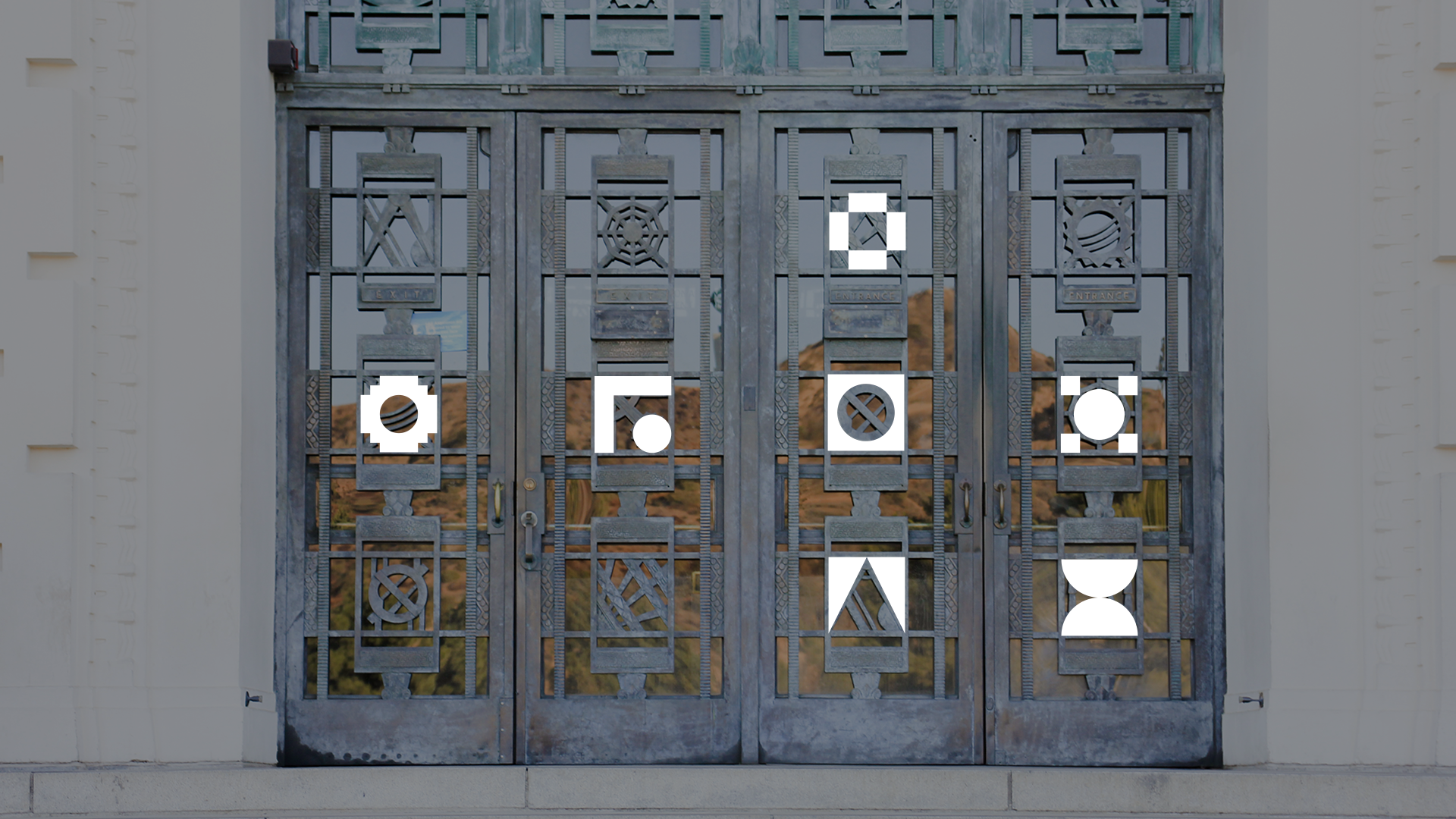
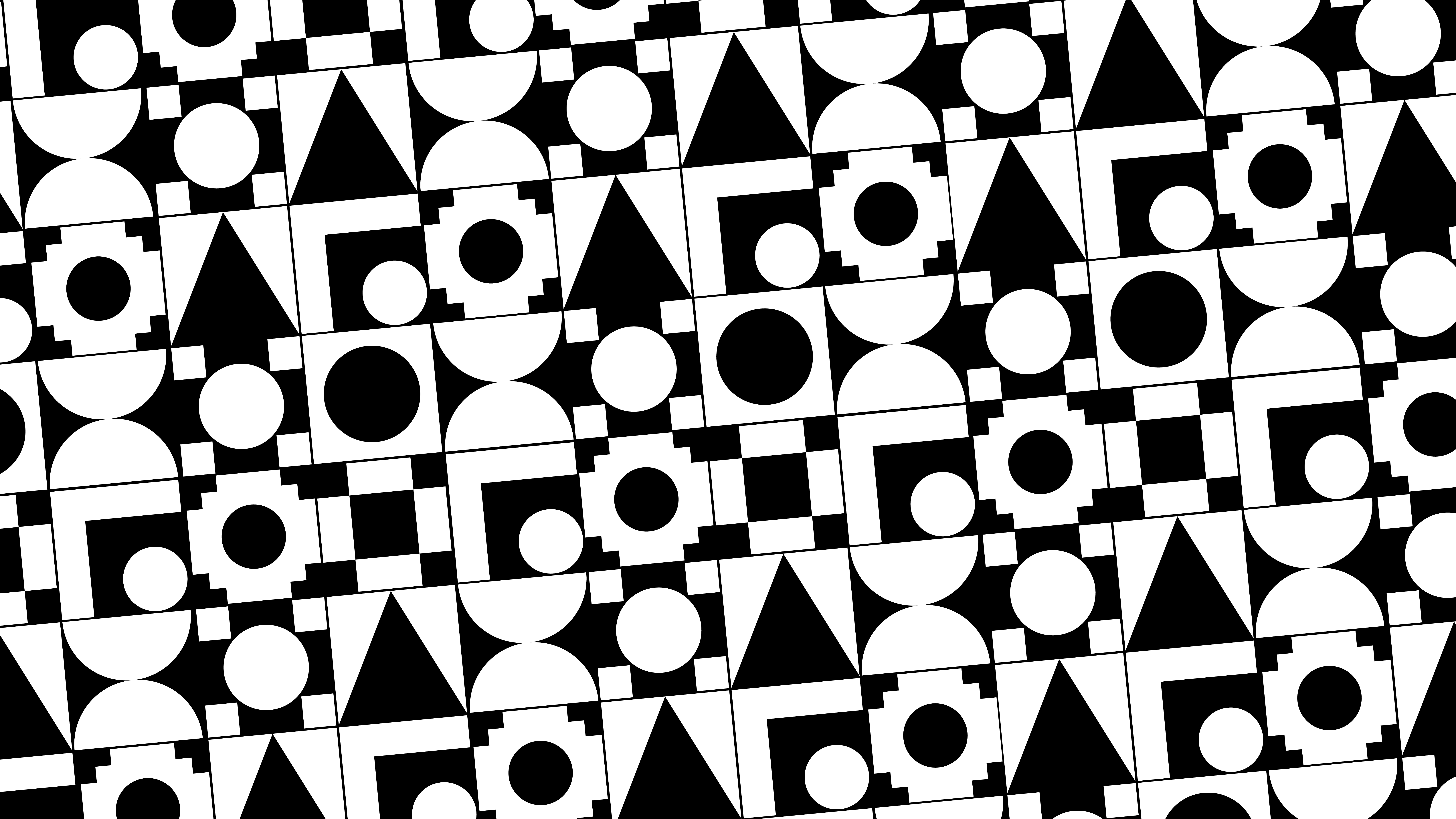
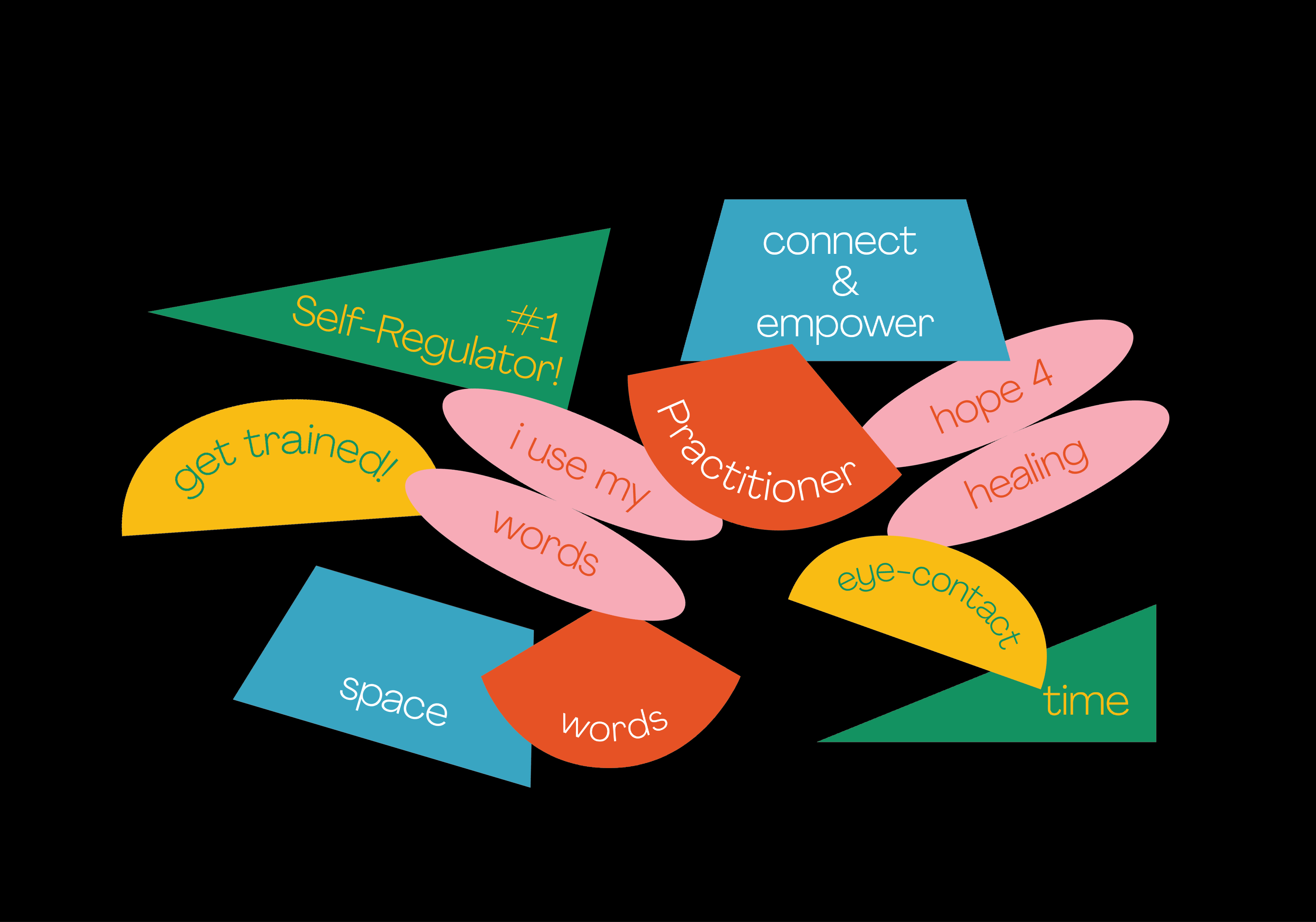
Beyond color, I wanted to equip OrphanWise with visual elements like building blocks. The shapes represent the principles of trauma-informed care used by the organization and expand into playful patterns used to add dimension to the brand identity.
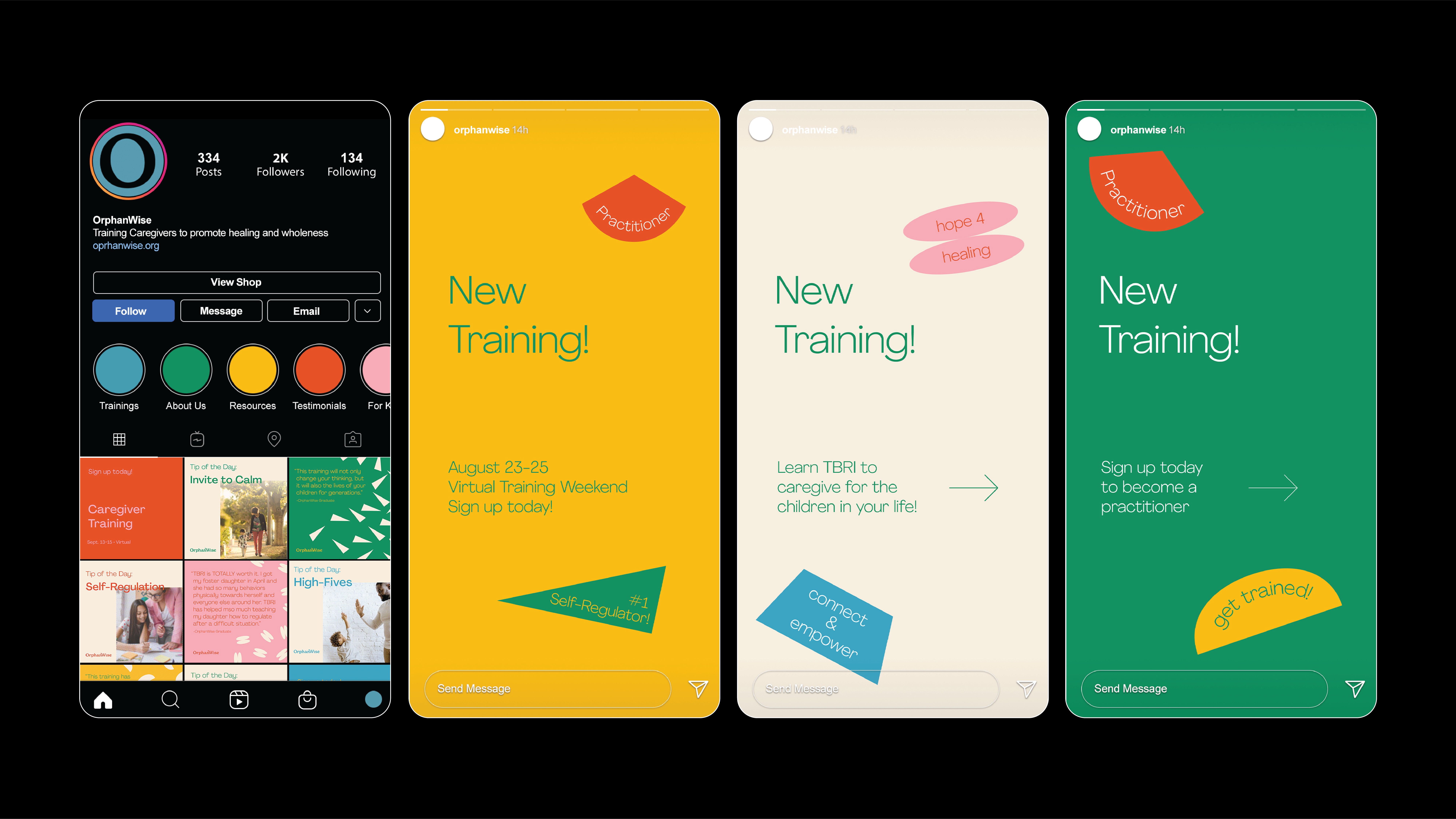
One of the key goals of this project was to create multiple paths of connection for donors and community members both in print deliverables and digital deliverables. The donor package includes informational pieces on OrphanWise’s methods, growth projections, and goals for the future.
As members who are community facing, connecting with their audience online was important to this team. To encourage engagement on social media from training attendees, I created custom sticker gifs that share some of the playful messages from OrphanWise.