CareEQUIP

2024

Creating a logomark to last for a non-profit training a community for care

CareEQUIP

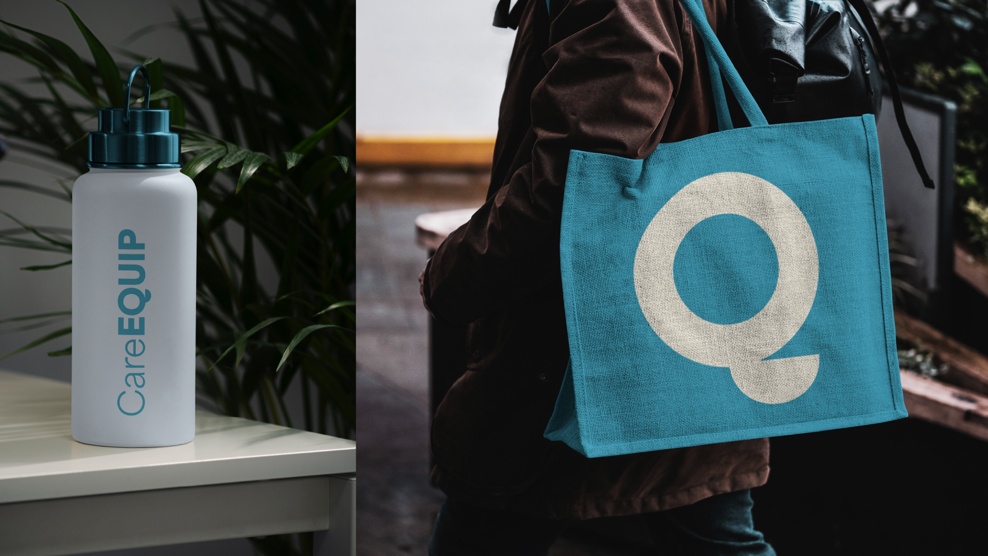
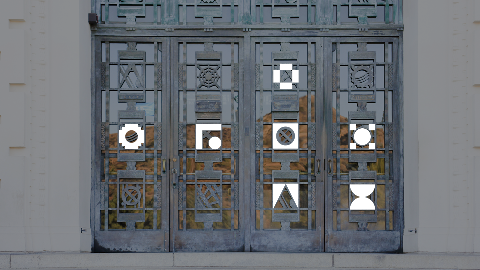
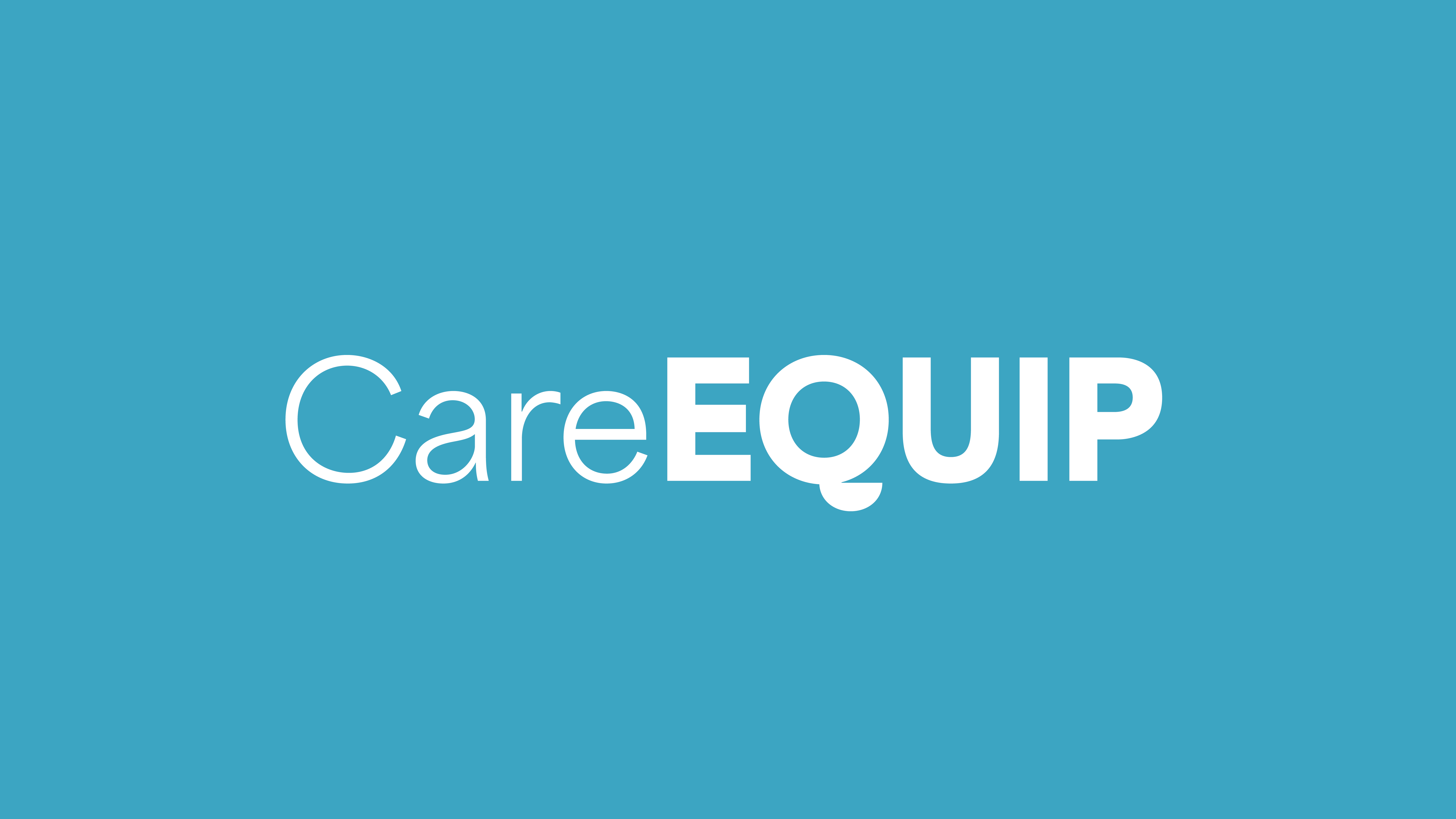
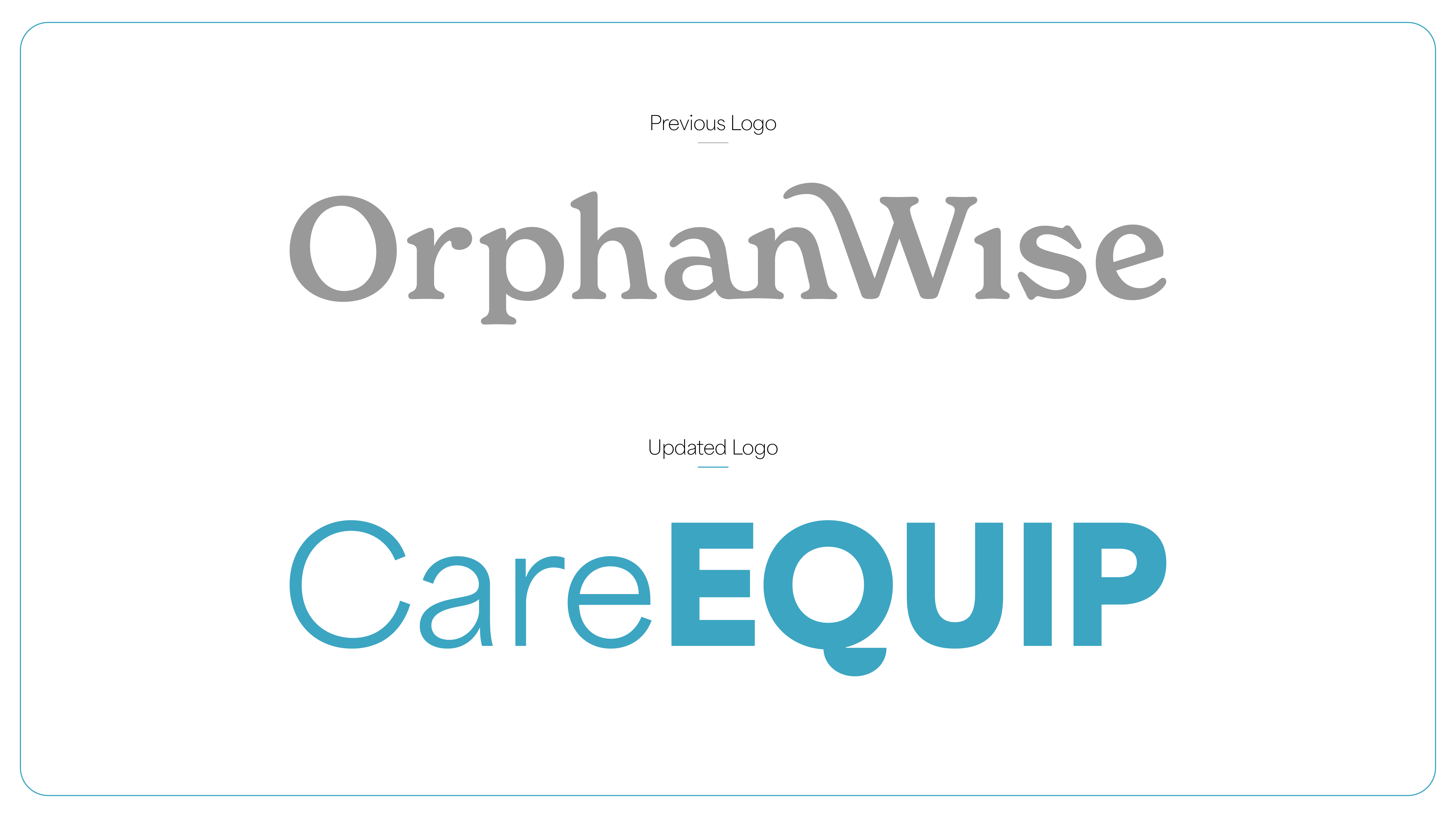
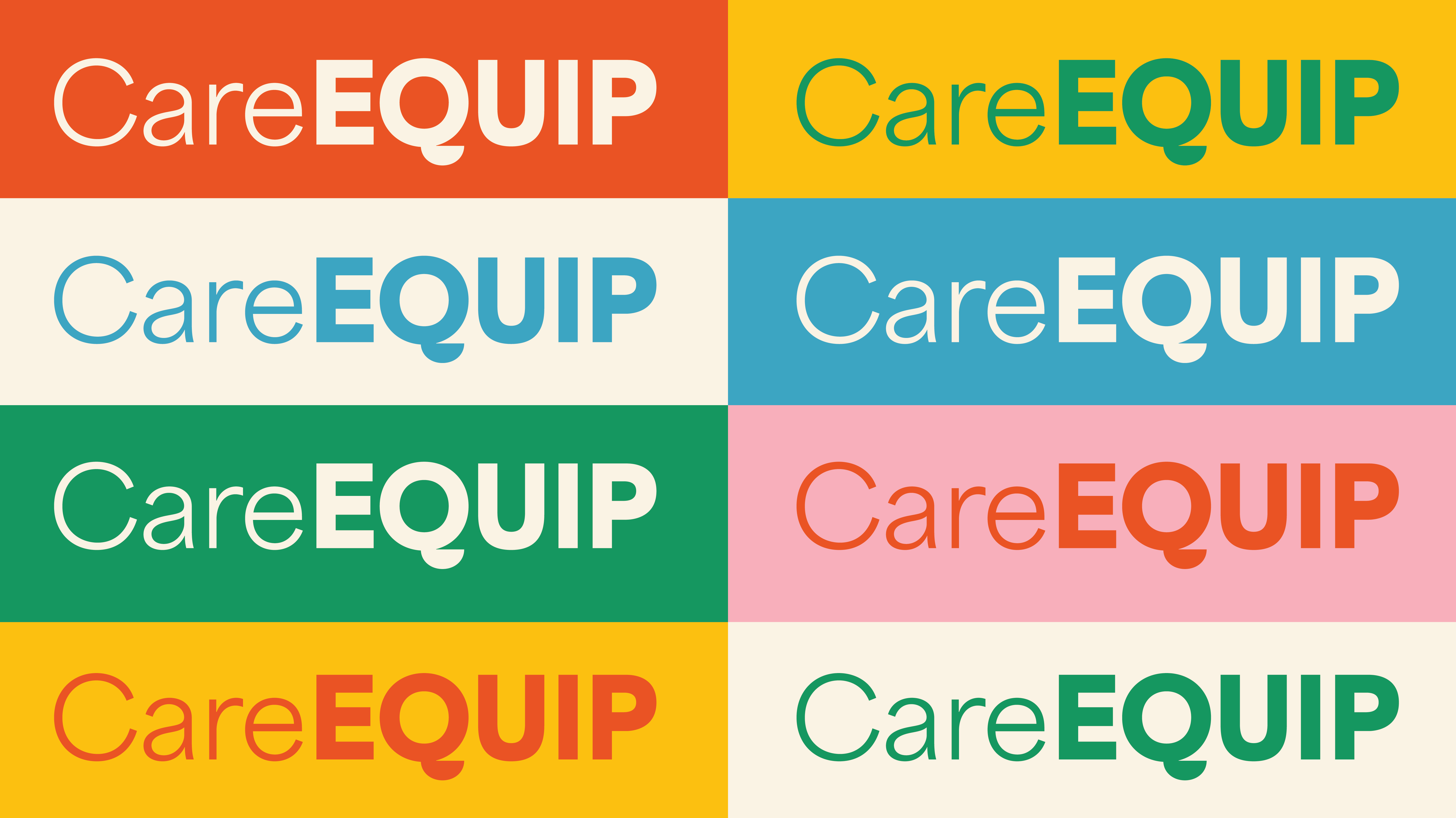
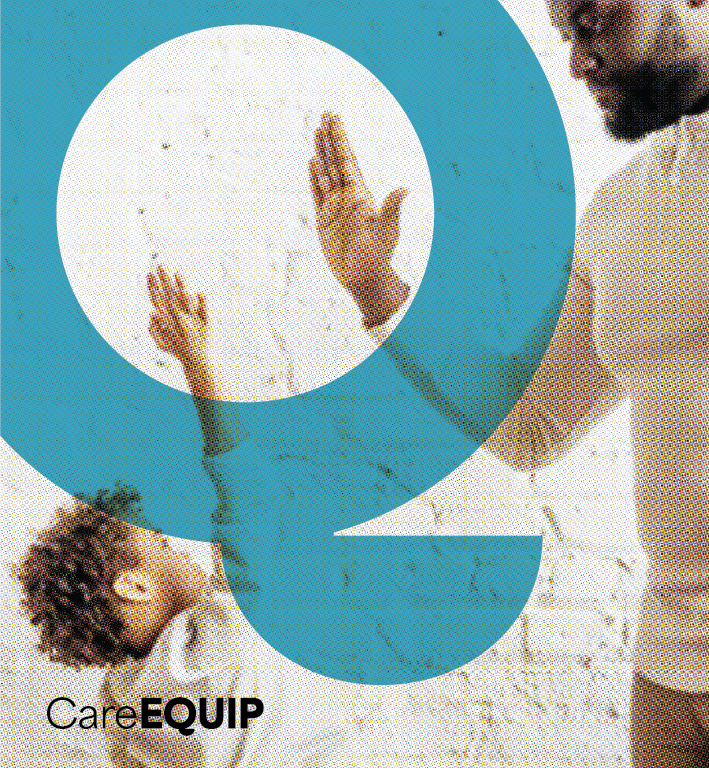
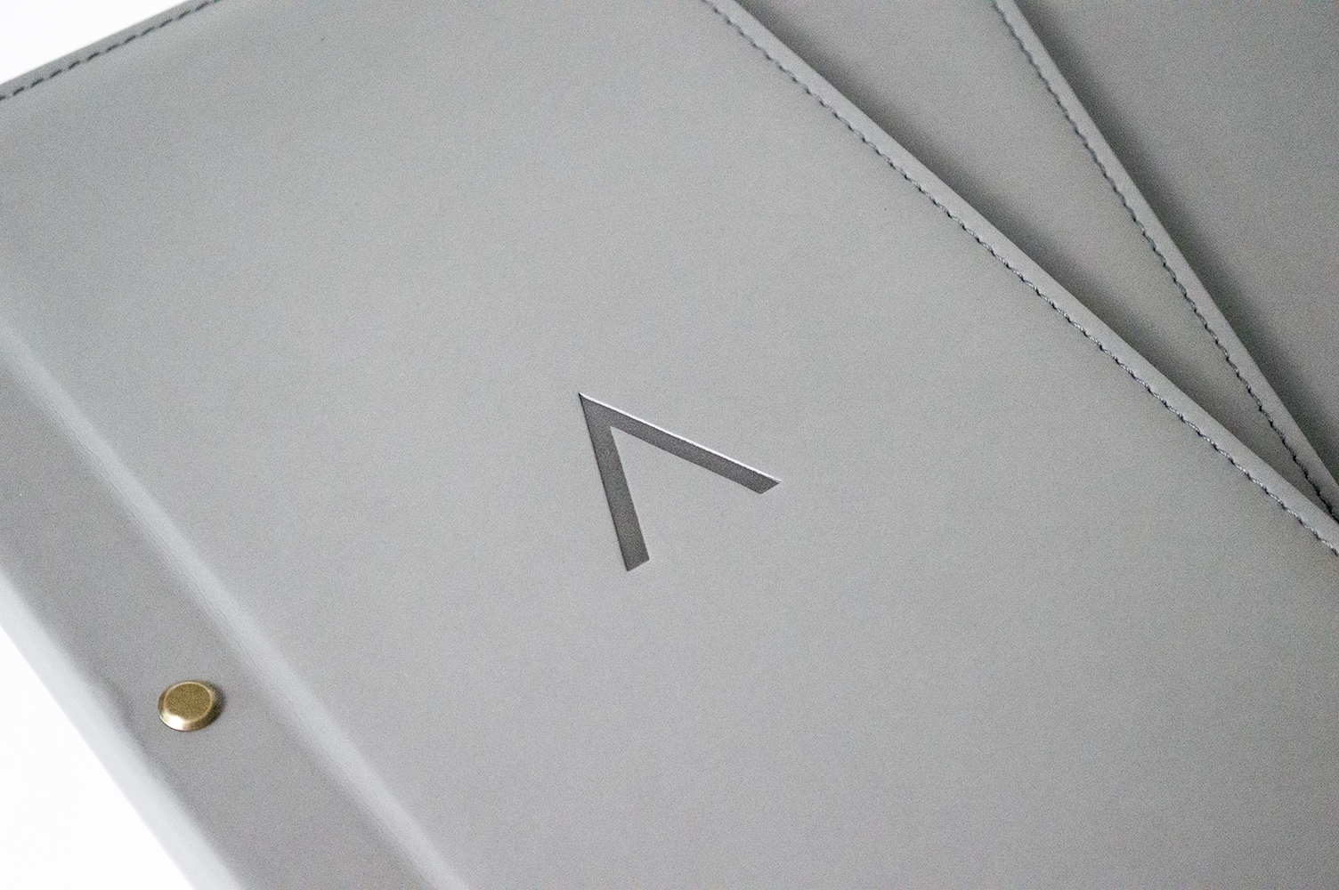
In 2021 I worked with a Tennessee-based non-profit called OrphanWise, which provides community trainings for adults caring for at-risk and traumatized children. When they decided to rename their organization to CareEQUIP, I was honored to work with them again to design and create a new logo that echoed their existing brand identity.

CareEQUIP
OrphanWise original logo compared to the new CareEQUIP logo.
No items found.
About the project

The core challenge of this project was to keep the existing brand voice intact. CareEQUIP centers around the ideas of clarity and play. We explored incorporating icons depicting home and care, but since CareEQUIP serves the whole community from the court systems to schools we kept the logo focused solely on their name.

Pulling from their previous brand identity, the CareEQUIP team shared with me that they loved their previous “O” icon because of its versatility in creating branded assets. I created a “Q” icon that allowed them to keep using a branded icon in this way that felt playful and fun.

CareEQUIP's logo system has the full word mark logo, a vertical stacked version with Care on the first line and EQUIP on the bottom, and the unique Q symbol.
A chart comparing the differences between the Q inside the word mark and the standalone Q which is rounder. When the Q's are swapped they don't fit as well in the other contexts.
A detail view of the 'Q's small details like a small wedge where the tail meets the bowl and slightly angular curves.
The solution

A key consideration in this process was to balance the Q as a standalone symbol and create a way for it to fit well within the logomark.

CareEQUIP logo applied info the many brand color combinations.
Graphic showing the Q icon being used to highlight a portion of a photograph: where a caregiver and child are about to high-five.
CareEQUIP
CareEQUIP
CareEQUIP
CareEQUIP
CareEQUIP
Results

I provided the CareEQUIP team with a logomark and a separate Q icon that feel and look the same, but function differently within their contexts. With a versatile and flexible logo, CareEQUIP now has branding that will grow with their organization for years to come.

CareEQUIP logo applied to a water bottle and tote bag.
No items found.

Check out more of my work

Let’s bring your

big ideas to life

Icon
Discuss Project
Discuss Project